FTMN Poll: Best poster of the week?
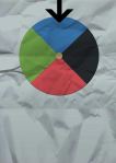
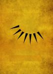
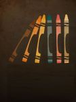
I haven’t decided for sure yet, but instead of the usual poll, I may use these Monday posts to highlight the minimalist posters I use in my daily Facebook game. If you haven’t visited our Facebook Page yet, be sure to check it often. I post a new minimalist poster almost every day with the title removed, and it’s your job to guess what movie the poster is for. There’s some great designs, good ones, tough ones, and some not-so-great ones. There’s only been a couple stumpers including one from this week, though there’s still not a ton of people playing. So which one’s your favorite from this week’s batch, and why?
Also, the current leaderboard:
David – 4
Jason – 3
Morgan – 2
Dust Raven – 2
Dusty – 2
Keith – 2
No One – 2
Dylan – 1
Silver Emulsion – 1
Rob – 1
Fog’s – 1
Tygenco – 1
Nick – 1
Posted on July 23, 2012, in Polls and tagged facebook, minimalist, movies, poll, posters. Bookmark the permalink. 5 Comments.


Reservoir Dogs or A Clockwork Orange.
Res because it takes something so simple and childish, even though the movie is incredibly violent.
Clockwork because it’s soooo simple.
Any time you can get something incredibly simple and still invoke the movie, that’s what makes a great minimalist poster in my opinion, even though Clockwork Orange didn’t get guessed immediately, I think it’s a pretty good one.
I guessed it right away ;).
The Res one is good, but I feel like it’s too easy (not for your contest, but for the creator of it) and I don’t like how aside form the obvious, crayons really have nothing to do with the film. It’s clever, but that’s all.
The Clockwork one is too similar to the actual one. It’s an element that’s prominent, just stripped out. Again, I like it, but my vote goes to (hypocrisy alert, perhaps) The Wizard. I say hypocrisy because I haven’t even seen the film, but I have a vague idea of what it’s about and the poster seems to be clever and somewhat abstract and still ties into the film.
Or maybe I’m talking out of my ass.
The Wizard is my favorite of the bunch too. I found a ton of similar Reservoir Dogs ones as ties, simple blocks, or squares, but the crayons one was always the one that popped up the most often, so that’s why I chose it.
I also think that a big part of minimalist design does just that – takes a prominent element and strips everything else out of it.